Split card
Pairs a concise explanation with meaningful imagery.
ISQ Rise implementation preview
Later that afternoon, Karen receives a message from Lily’s mother requesting a meeting.
Light background shown; verify against a tinted or dark surface where the component is used that way in course.
Use when / avoid when
Use when
- Explanation genuinely benefits from a relevant photograph.
Avoid when
- Generic stock imagery, or content too long to sit comfortably beside media — use a text-led panel instead.
Anatomy
- Split container (.isq-split)
- Content side (.isq-split__content)
- Media side (.isq-split__media)
Variants
States
Responsive behaviour
Restacks to one column at 760px; image uses a fixed aspect ratio.
Accessibility
- Meaningful alt text on the image; decorative images marked accordingly.
Current implementation
Theme and platform: ISQ · Articulate Rise
Implementation type: custom-html
The classes below belong to the ISQ implementation namespace. A future theme may implement the same component contract with different tokens and class names.
Dependencies: Production CSS only.
Code
<div class="isq-panel isq-panel--elevated">
<div class="isq-split isq-split--content-wide">
<div class="isq-split__content isq-content isq-content--compact">
<p class="isq-body">Later that afternoon, Karen receives a message from Lily’s mother requesting a meeting.</p>
</div>
<div class="isq-split__media">
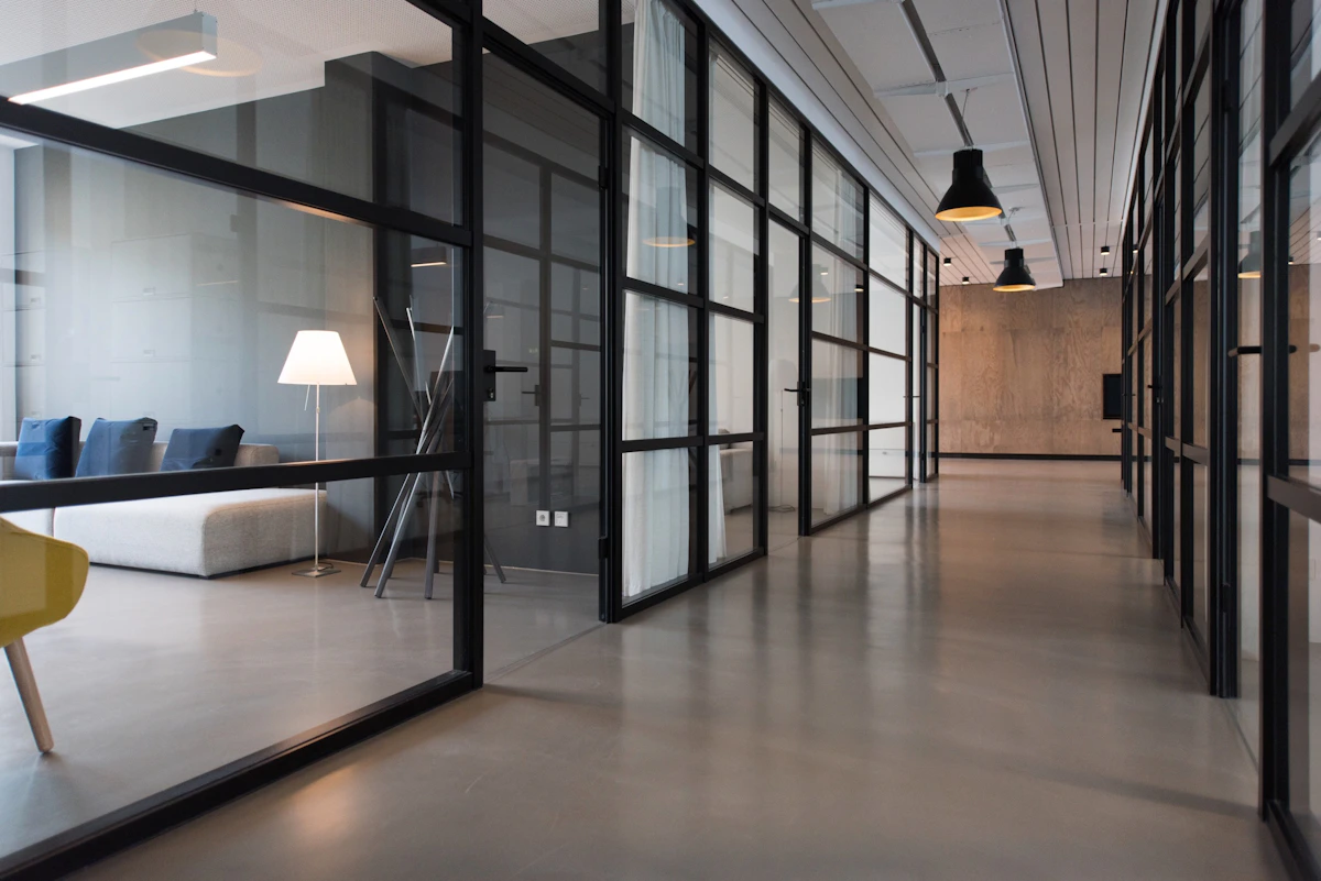
<img src="https://images.unsplash.com/photo-1497366754035-f200968a6e72?auto=format&fit=crop&w=1200&q=85" alt="Contemporary office workspace with glass meeting rooms" width="1200" height="900" loading="lazy">
</div>
</div>
</div>Classes used: .isq-split, .isq-split--content-wide, .isq-split--image-left, .isq-split--media-wide, .isq-split--thirds, .isq-split__content, .isq-split__media, .isq-split__media--contain
Governance metadata
| Owner | Design and development steward |
|---|---|
| Status | Core |
| Version introduced | 1.0.0 |
| Last reviewed | 2026-07 |
| Known limitations | None recorded. |